Office Mobile: Design Explosions #4
Hullo and welcome to issue #4! If you’re new to Design Explosions, here's the gist: Design Explosions tries to do design critique in a way emphasizes benefit of the doubt. Here are our guidelines while analyzing designs:
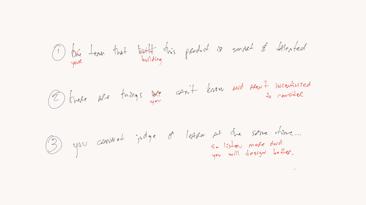
- The team that built this product is full of smart people.
- There are many things we can’t know without joining the team.
- You can’t judge and learn at the same time.
Issue #1 compared Apple Maps and Google Maps, issue #2 went deep on the PBS Kids design, and #3 explained why NeuBible is the best reading app I’ve ever used. For issue #4, I presented live at a conference, and this is the rough transcript of my talk.
Today I’ll be talking about Office Mobile, with a twist: my team actually designed this! This means there’s no need for the normal Design Explosions benefit of the doubt. I know exactly why we did the things we did, and the lessons are applicable to anyone making software on mobile devices. So even if you don’t use Office, or design productivity apps, there’s a lot here to learn from.
One important detail before we get started: I’m not sharing this to make me or my team look good. Many case studies follow this formula:
- I am awesome.
- So I decided to do this awesome thing.
- Isn’t it awesome?
- Hire me.
But I’m not trying to convince you I’m a great designer, or land a new job, or argue that our design skills are so great that our final result felt inevitable. Instead, I’d like to speak honestly about what worked, what didn’t, warts and all. Think more behind-the-scenes documentary and less PR puff piece.
My hope is twofold: that junior designers can get a more accurate picture of what it’s like to ship software at scale, (messy, hard, and the end result is often disappointing) and that senior designers write more articles like this one. We don’t need more Thought Pieces About Great Design. We need more people to honestly document the ups and downs so we can all improve together.
Brand vs Platform
Office Mobile actually refers to multiple apps on multiple platforms. I was tasked with leading the design on PowerPoint, Word, and Excel on Windows Phone. This was a natural progression after my time as a design lead on Windows Phone. I have plenty of friends on the Windows Phone team and I know how the interaction models work, so I was a natural fit. But that led to our very first question, one that every team struggles with throughout the design of a new product: how much should we align with Windows Phone and how much should we align with Office?
There’s no right answer. Go too far in the “platform alignment” direction and your app feels boring. Vanilla. Lacking personality. Best practices and common controls are all well and good but brand still matters.
On the other hand, embracing the company brand sounds like a good idea but many companies overdo it. They work to get company typefaces, logos, colors, and even interaction models crammed onto the screen, but it’s easy to go too far and have a result that feels ill-suited to the platform.
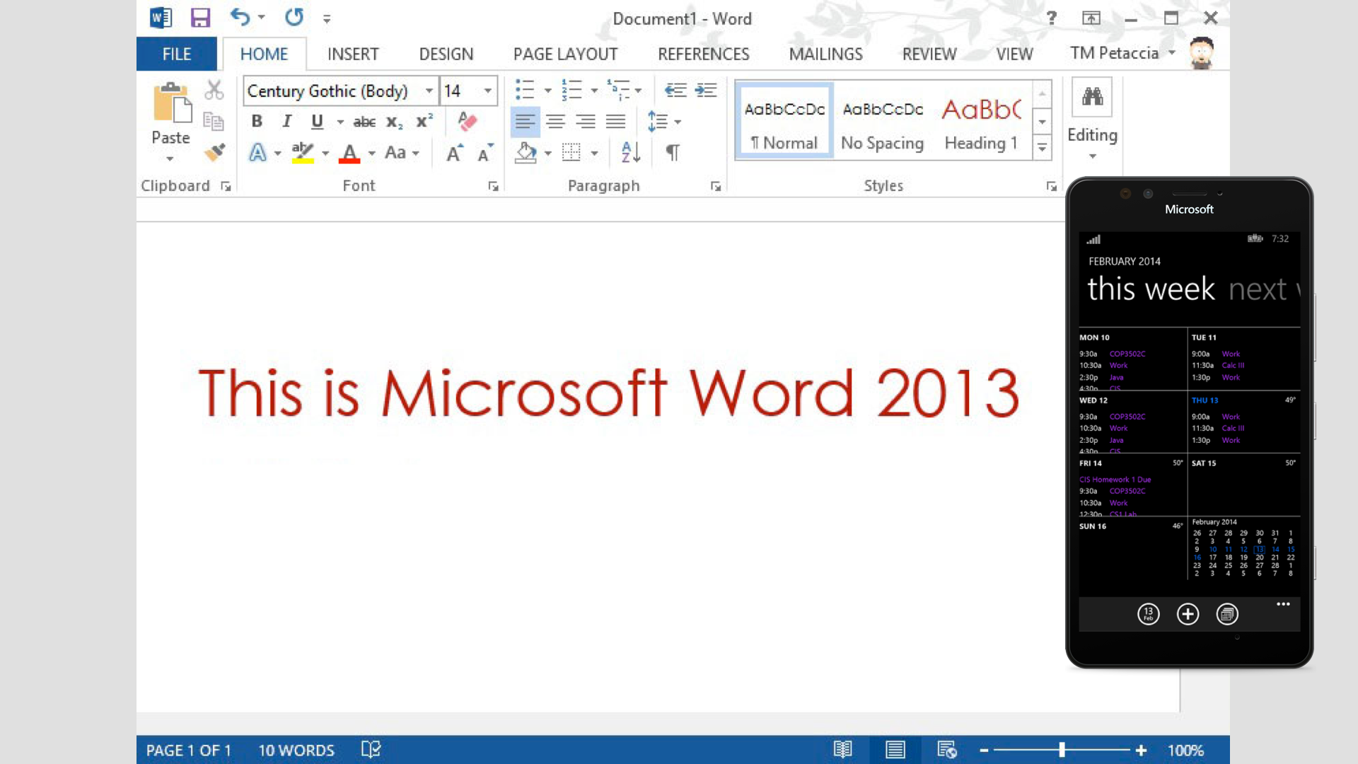
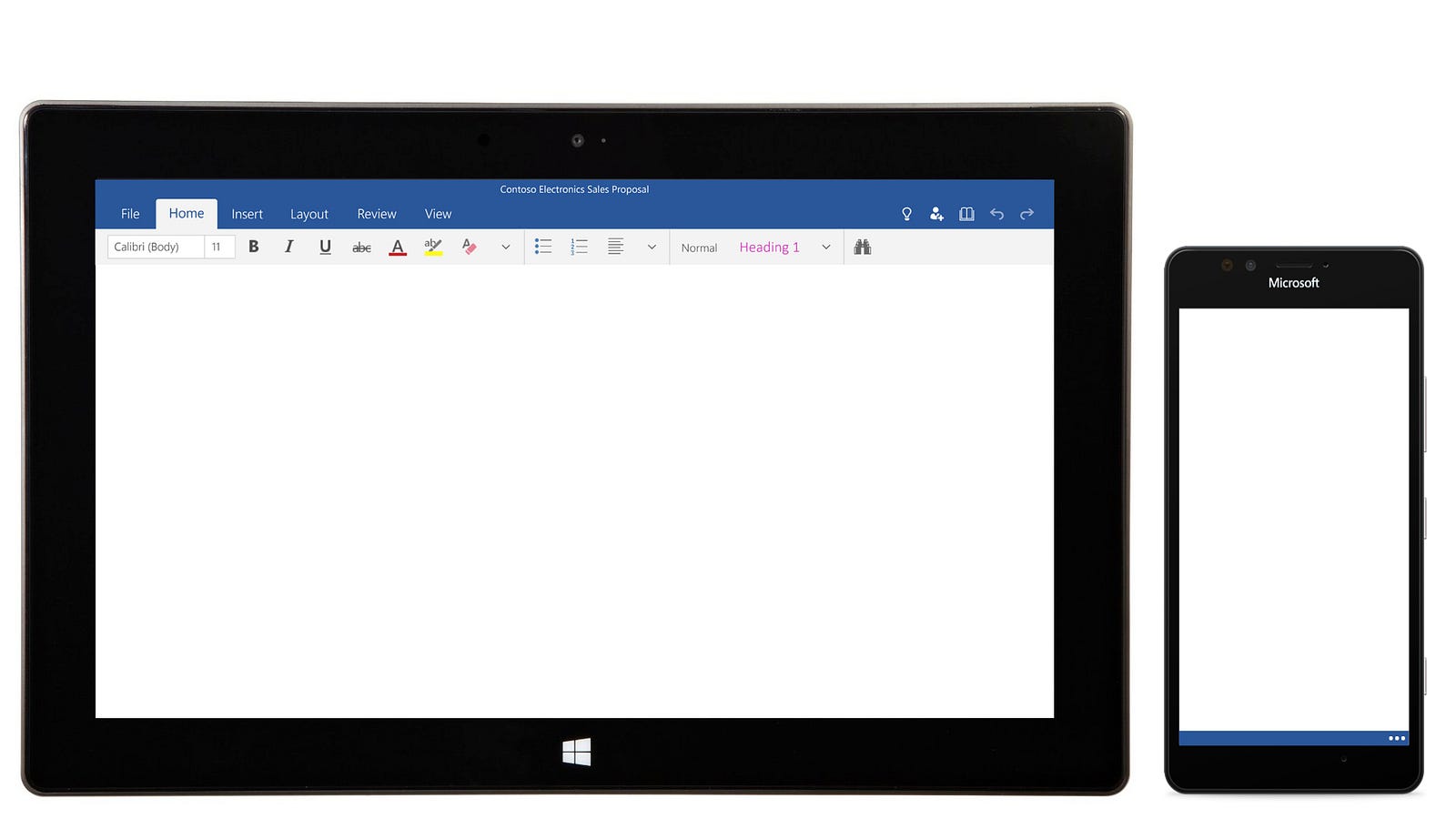
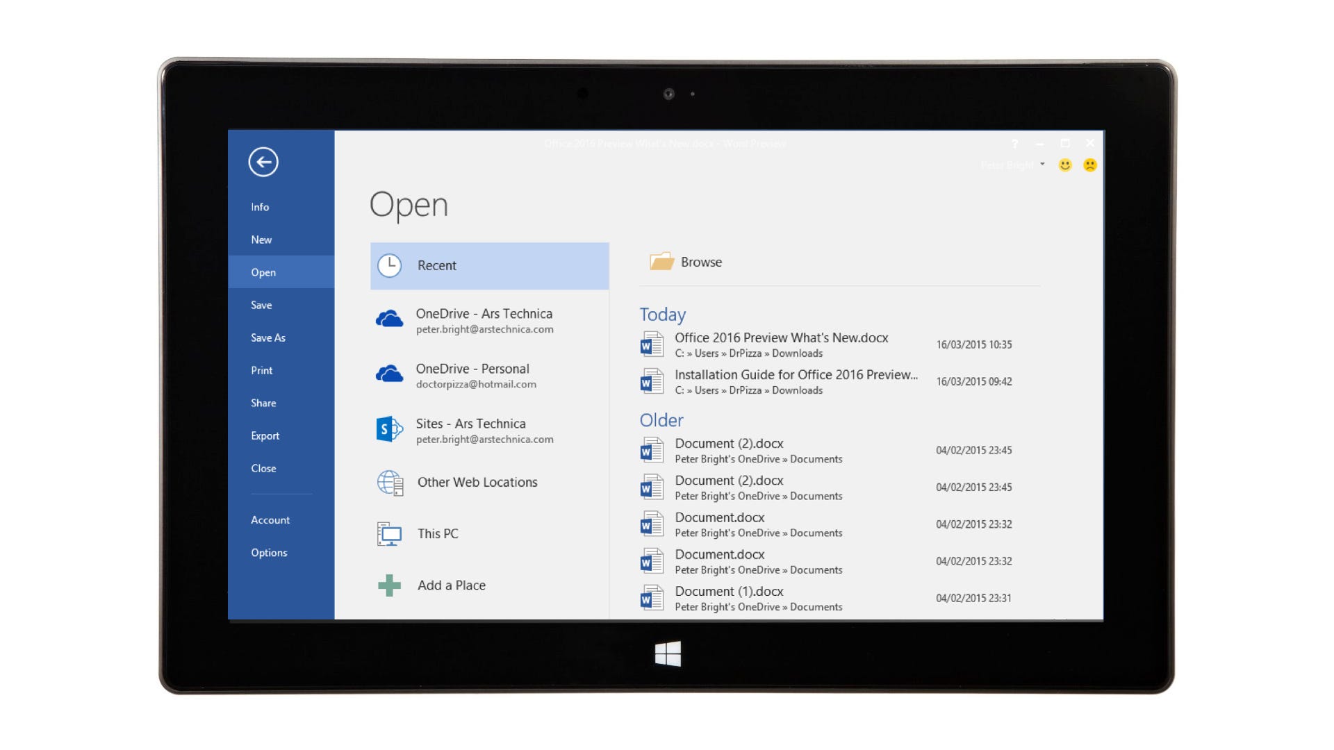
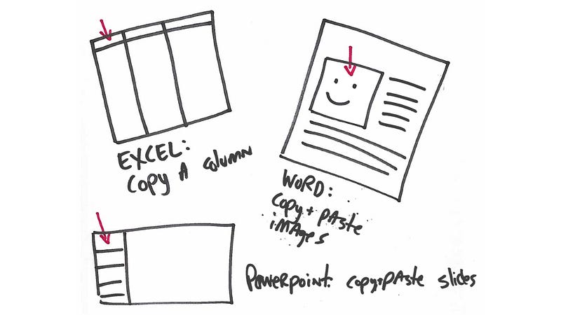
Obviously the answer is to strike a balance between the two extremes, but finding that balance can be an extremely difficult process. For example, look at this screenshot of Microsoft Word next to the Windows Phone 8 Calendar app. Everything is different, from the interaction models to the feel of the visual design.
Every company that ships software struggles to find the balance between Brand and Platform. And it’s not the kind of thing you debate once and resolve. In my experience every team, building every feature, for every release, always has this tension on their mind.
At Microsoft the issue is a bit more delicate. The Windows Phone team and the Office team are in different organizations, and they’re not known for working well together. The people are smart and talented, and collaboration between individual stakeholders is good. But in any company, you’re going to get more credit for helping yourself and your team than helping someone on another team in another organization.
So if you ask a Windows Phone designer how Microsoft Office should look on their hardware, they’ll have a Windows Phone-centric answer. And if you ask someone in Office, they’ll have an Office-centric answer. Again, no one is malicious or wrong, but priorities and incentives affect our judgement. If that weren’t hard enough, there’s another difficult question every software team struggles with when porting. How much should the various platforms (and web) align with each other?
Platform vs Platform (vs Platform vs Web)
Even after finding that perfect balance between app branding and platform conventions, you have to figure out how you’re going to port to other platforms. For example, let’s say your company makes an iOS app and later decides to move to Android. Then what?
Most companies decide to reuse the same iOS design. And why not? They’ve already spent a fortune finding the brand/platform balance once, so why re-invent the wheel for a second platform?
They soon crash head first into the realities of porting: designing once for multiple platforms is, and always has been, a myth. It didn’t work with Java. It didn’t work for web apps. It doesn’t work for iOS/Android. Porting will never work as well as designing with the target platform’s best practices in mind. But that doesn’t stop companies from trying. “They’re all just touch-first smartphone operating systems!” the executives reason. “How different can they really be?”
Well. About that.
For starters, Android has a hardware back button and iOS doesn’t. It’s just a single difference, one that doesn’t seem like it should affect the software design. But it does, to a tremendous degree. Oh, and Android strongly recommends only putting navigation across the top ( until recently ), whereas iOS is fine with bottom nav. Android recommends the “hamburger menu” pattern. iOS strongly recommends against it. Theoretically, those are only three differences. But that’s the same number of theoretical differences between Beyoncé and Danny DeVito — height, color, gender — but even three differences can lead to a vastly different result.

And of course our team wasn’t dealing with iOS and Android; we had to figure out how to reconcile Microsoft’s Windows Phone with Microsoft’s Office, while knowing that our designs would also need to apply to iOS and Android as much as possible. Plus the Steve Ballmer edict (since retired) that our software be “first and best on Windows.” That’s a lot to consider!
Responsive Design
Then we needed to ponder how our design would scale from 4-inch phones, to bigger phones, to small tablets, to big tablets, to desktop PCs, all the way up to 50-inch mounted displays.
We quickly realized it was no longer possible to split the experiences based on hardware alone. We knew Windows Phones would be running Windows 10, complete with mouse, keyboard, and monitor support. In fact, I had some friends working on reconciling Windows Phone and Windows, and in our informal lunchroom chats, the design issues they were trying to reconcile sounded meaty and complex.
Beyond that, we knew the Microsoft Surface was trying to be the kind of “tablet that could replace your laptop,” with modes for toggling between the different details you’d expect from touch-first or mouse-first interactions. Further, we began seeing more giant phones and ever-tinier tablets. I’ve done a lot of responsive design on the web, but this was a whole new level for me. It was like going from checkers to 3D chess. Upside down. On fire.
Of course, Android had been designed with this philosophy since day one, and iOS has added more resolutions and views each year for the last several years. So we knew whatever our Office Mobile strategy entailed would need to scale well across Windows Phone, iOS, and Android. Not to mention web.
My Small Self
And of course all this complexity and all these considerations each have stakeholders attached. My two-person design team was in charge of the design, but that role is only as impactful as the supporting cast.
In our case, we needed to work closely with the product manager leads from Word, Excel, and Powerpoint. Since they were leads, they had PMs reporting to them. And each of those teams had developers. And there was also a fourth team for things like open/save, services, and our overall interaction model. So that brought still more product managers and developers.
Oh, then there was that team’s leader and perhaps 15 other executives who cared deeply about what Microsoft’s marquee software would look like on Microsoft’s marquee hardware. Everyone from the CEO of Microsoft to the head of Office to the head of Office Mobile, and plenty more besides.
Then there was the entire Windows Phone team design studio, who weren’t directly working on Office but cared deeply about what they were going to be including by default on their phones. But the designers were just one faction, of course. The Windows organization is full of product managers and developers, each tasked to make their feature great.
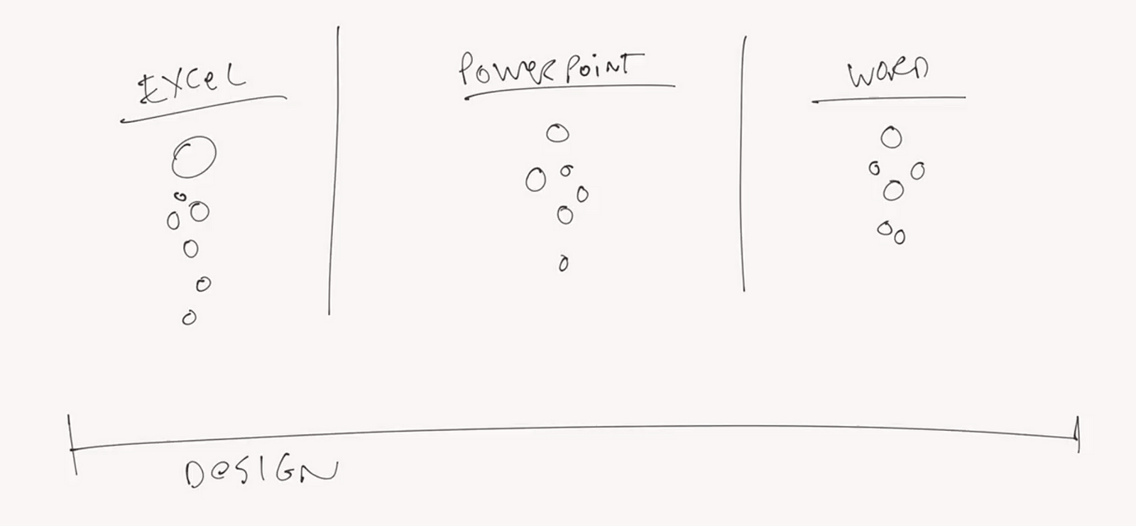
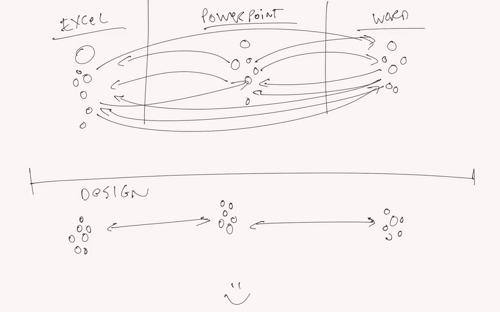
Then there were the two other platform teams: iOS and Android. iOS was on campus, a short walk down the hill from my building. The Android team was in India, which meant a lot of long distance travel to make sure we were aligned and moving in the same direction. Then the team working on Office on tablets, and before you know it the map of stakeholders on my product looked like this.

This diagram doesn’t do the partner map justice. At one point I counted around 300 people I’d need to coordinate with (I haven’t even mentioned my manager, the best manager I’ve ever had at any company; she’s now working on HoloLens!), but it was looking too complicated. So we’ll stop there :)
Before you write this complexity off as unique to Microsoft, I should point out I’ve drawn similar stakeholder maps at every company I’ve been in. The larger the company, the more complex the project, and the larger this map gets. It’s not the quantity of people that keeps you from great software, it’s how much incentive each person has to work in good faith with one another.
That’s true on a two-person team* or across a two-hundred-thousand-person corporation. In my case, I was fortunate to be working with a large group of people who truly wanted to collaborate. It was just a matter of understanding their roles and aligning to their incentives.
*Ever been on a team of 2 or 3 people that can’t figure out how to work together? I have. Rapport matters more than the team size or the raw talent .
Vertical vs Horizontal Friction
As a designer, I think of myself as a “horizontal” resource. Most product managers are in charge of a few singular features, which is more of a “vertical” mindset. For example, I may not have as deep an understanding about all the ins and outs of Microsoft Excel the way the lead PM might. He or she will always have a deeper understanding, in this case gained from almost a decade of experience. But while my understanding may not be as deep, it’s broader by design. I need to consider best practices on the platform, or reconcile what Excel is doing with what the Word and PowerPoint teams want to do.
Which isn’t to say that either vertical or horizontal is “better.” They’re not. For example, a party needs vertical thinkers like DJs (music) and caterers (food), but also a host or a party planner to tie it all together. No one expects the DJ to think about anything other than music, and no one expects the party planner to know how to prepare a flambé. If both vertical and horizontal thinkers are doing their jobs, and respecting their partners, things work out great.
In one of our first meetings, I brought the product managers together and told everyone we were going to design each of our three apps on a whiteboard for 90 minutes. There was one catch: no one was allowed to design the apps they were experts in.
So the Excel people designed Word and PowerPoint. Word folks designed Excel and PowerPoint. And the PowerPoint team split up onto the Word and Excel teams. The results were amazing: suddenly my experienced, battle-hardened PMs were thinking like horizontally-minded designers. Perfect!
A lot of research has gone into the benefits of diversity. Whether it’s socioeconomic status, gender, race, or balancing between introverts and extroverts, we know diversity is valuable. We know in the long term, the quality and range of ideas goes up when a group is more diverse. We also know in the short term that there can be some friction as everyone figures out how to communicate with each other. It takes time to build rapport.
This activity was new to the team, but it worked. The head of Excel told me it reminded him of being back in school “… in a good way!” And I think that’s why it was so successful. It was fun trying to design another app, because the stakes were low and everyone was learning together. No one got to pull rank, because we were equally clueless. Especially me, since I had only been on the team for a week. It was extremely helpful to be able to watch from the sidelines to get a bit more vertical understanding about these three very different applications. The better you listen, the better you design. And everyone has something to teach you, especially your vertically-oriented stakeholders.
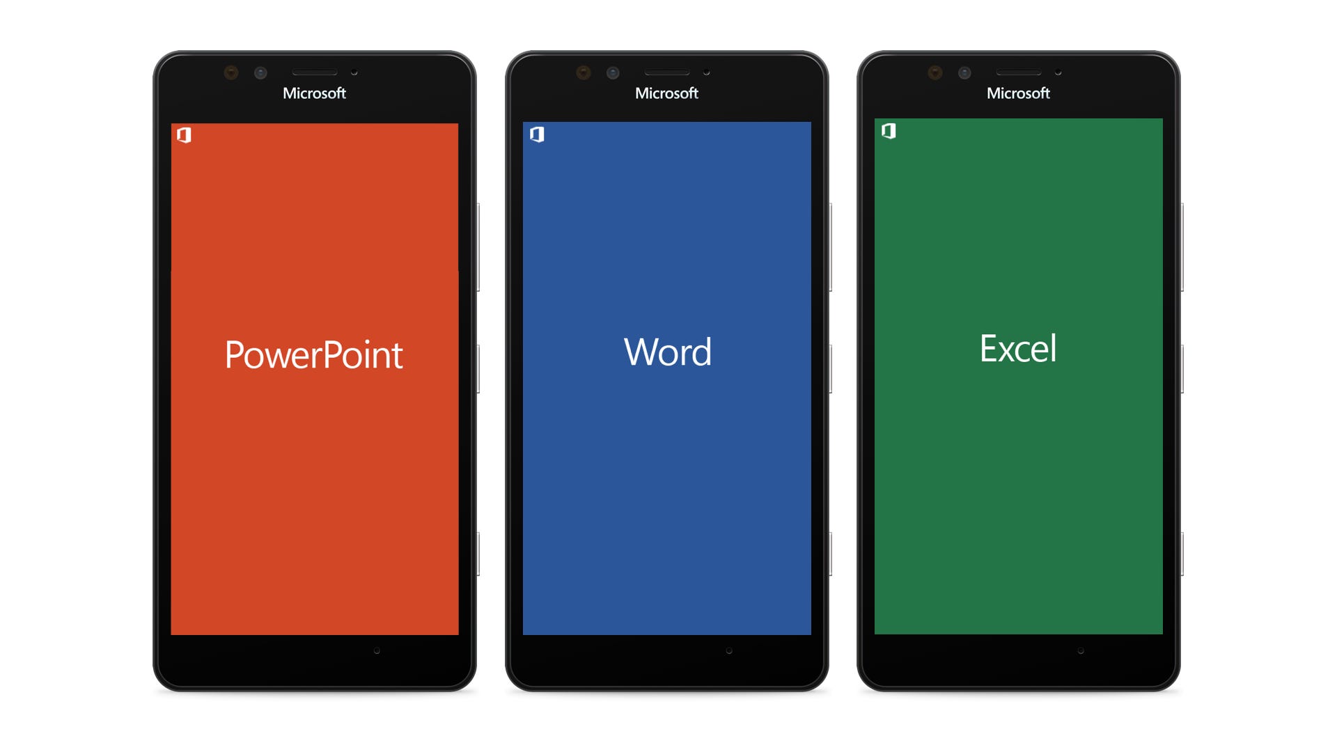
Say Hello to the Three Sisters
To re-iterate what we needed to do, product-wise: we needed to figure out how much to align with Windows Phone’s traditional “Metro” look and feel versus how much to align to Office’s own look and feel. Then we’d need to figure out how to reconcile that with iOS and Android. Then we’d need to figure out how it’d work across all screen sizes.
That was a lot to consider, so we started using the term “stake in the ground” a lot. We needed a stake to build everything out from. Does this metaphor refer to a tent? I’m not much of a camper. Not after that crazy summer in 1994. Either way, we needed to stop theorizing about everything on whiteboards and do some explorations to see how they felt on screen.
We kicked off three explorations that we called the Three Sisters:
- Norma would be pure Windows Phone (“normal”)
- Tabitha would align to the Office chrome (“tabs”)
- Solana would try very hard to be nothing like Norma or Tabitha
In the interest of telling a clear narrative story, I’ll show the best examples of each of the three. But every one of these ideas had tons of iterations, discussions, and reversals. Like all good software design does.
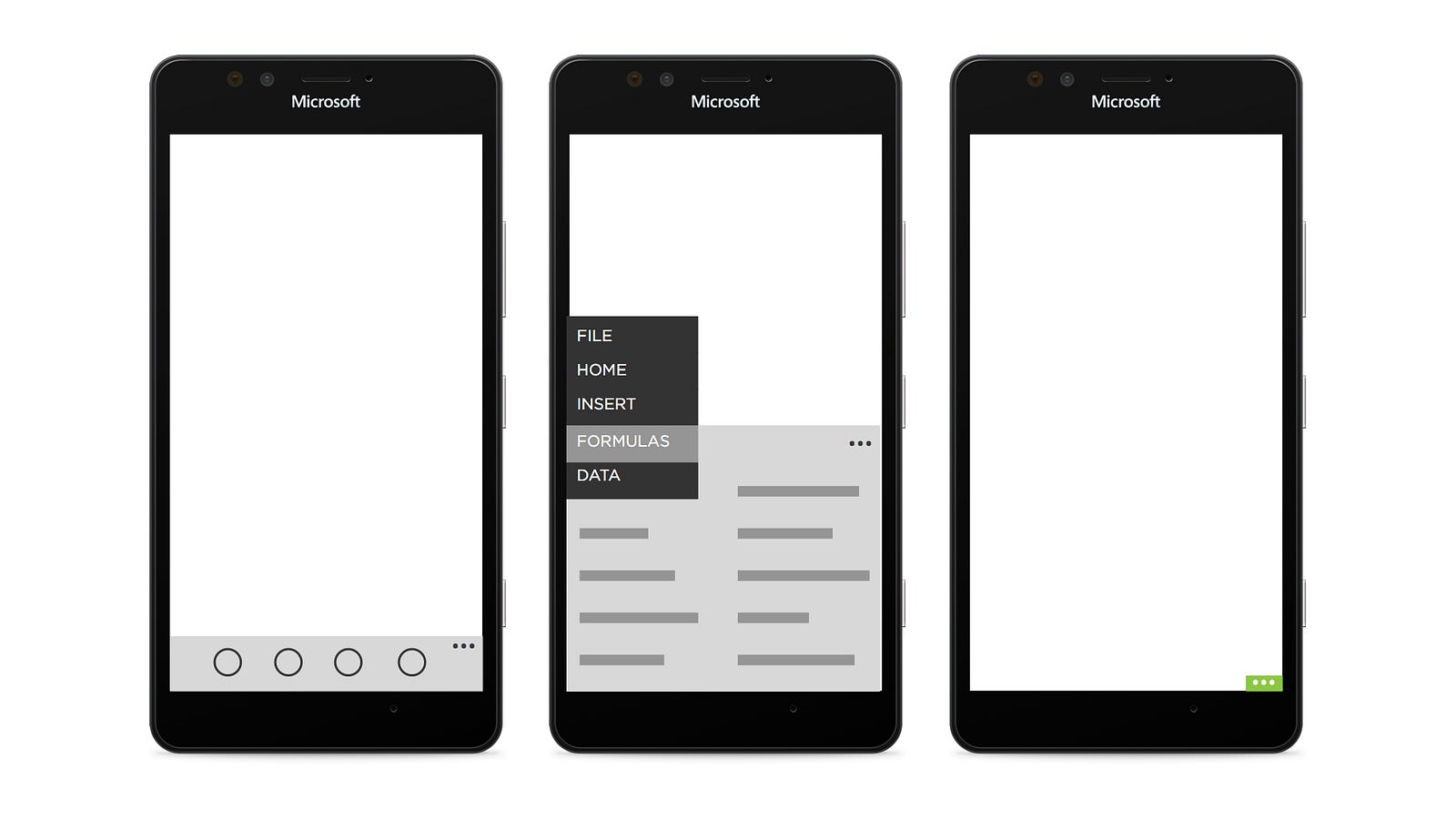
First up, Norma:
We knew in our gut that Norma wouldn’t work, because Windows Phone’s UI only allows for about 10 menu options, and Office requires hundreds. But this exercise helped us convince ourselves, and more importantly the Windows Phone team, that Metro just wasn’t made for apps of this complexity. We also explored putting Adobe Photoshop on Windows Phone and ran into the same insight: we needed a more scalable interaction model.
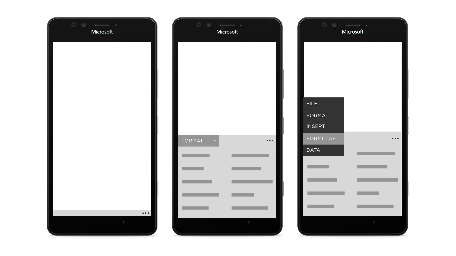
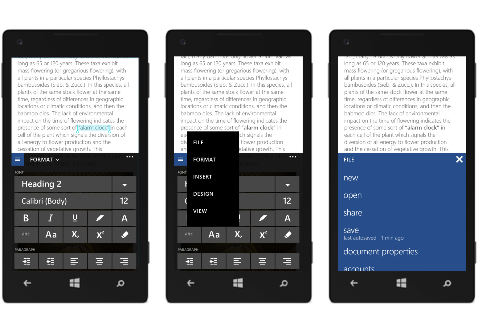
We had higher hopes for Tabitha. The thinking here was that we could take the “Ribbon” UI of Office and maybe collapse each of the panels into a dropdown menu. Here’s what we ended up with:
We didn’t love how alien it looked while minimized — nothing on Windows Phone looks like that, let alone iOS or Android — but we did like how items came up in a half-sheet. We started referring to these half-sheets as “palettes,” partially because of our Adobe Photoshop explorations. We also loved how the dropdown allowed us to scale to an infinite number of options. And let’s call a spade a spade: Office feels like it has an infinite number of options. You should see the spreadsheets we kept in order to track all the complexity. It was intense.
Then there was Solana. These explorations were fun because the guidance we gave ourselves was “Solana is not allowed to do anything that Norma or Tabitha are doing.” Which meant things got a bit crazy. We have a zillion screens, but here’s one representative example of the work.
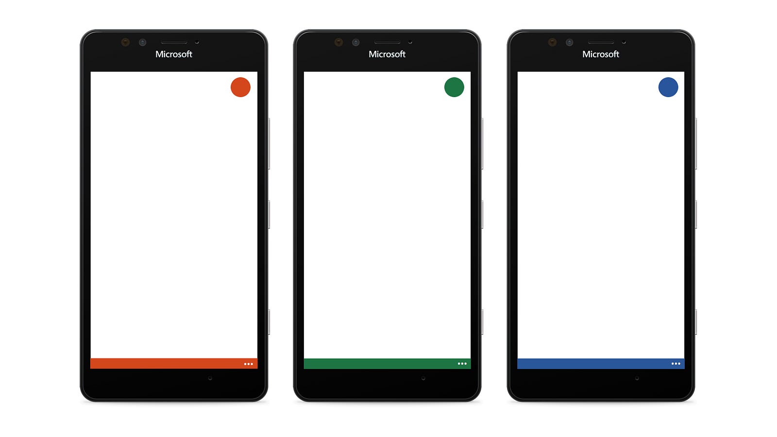
There’s a lot going on here, but what we particularly liked was the personality that could show if you tucked everything away and just had a jaunty little lime green item peeking up. Hm. What if instead of lime green we used Word blue, PowerPoint orange, or Excel green? That could work.
(Side note: I did none of these explorations myself. I was spending all my time shuttling between a few dozen stakeholders, keeping them updated with our thinking, coordinating and negotiating between teams, and predicting the political weather we’d be operating under. Fortunately I had a great designer to work with. She did all these pixels while I played at multi-tier cross-organizational diplomacy.)
The Great Reconciliation
After much discussion, and to the surprise of no one, we decided we liked components of all three designs. We liked how Norma felt at home on the system. We liked how Tabitha scaled. And we liked how Solana deferred to the content, leaving behind just a tiny little touch target for getting into the multiple palettes to edit content.
So we combined all the ideas together and ended up with this:
We liked this direction, so we started shopping it around. Everyone understood the general premise, and had helped us shape it, but it was really useful to have a motion study to show it working in action. In this demonstration, the user deploys the keyboard to correct a typo, then changes the font size, then uses the palette picker to move to another palette.
Around this time the iOS team was shopping around their own motion study. Notice how the visual design and some interactions are more iOS-esque, but the flows are pretty well aligned with ours. This wasn’t an accident, of course.
The Android team agreed with our direction, but had some concerns. This was before Material Design was announced, but the design still struck the team as being a bit too Windows Phone. Notice in this prototype how the chrome doesn’t appear until the user taps. This was all part of trying to make sure we had one vision for Office, but one that didn’t conflict with the three platforms (plus web) we were designing for.
Again, and much to my delight, no team had veto power over any other. Android moves the most units, iOS makes the most money, and Windows Phoneis Microsoft’s own OS. So we all had reasons to fight hard for our own platform point of view, but we also understood that everyone’s perfect design was going to look a bit different across teams. That was good because it let us align to each platform rather than trying to shoehorn one design into every form factor.
Big Windows
Speaking of shoehorning designs, we couldn’t afford to let the “Big Windows” and Windows Phone versions stray from each other too much. The teams spent a lot of time sharing notes, so when we landed on this it was a joint design that both teams agreed with.
We spent a long time making sure this was really the best approach. We played with the idea of putting the tablet ribbon on bottom to be more like Windows Phone, or putting the Windows Phone palette on the top to be more like Windows. But it just didn’t work because of where the keyboard would need to line up. Here’s a whiteboard diagram I drew many times:
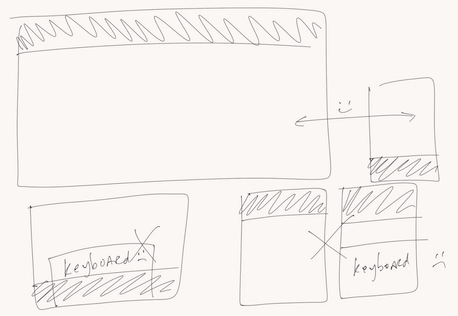
If we had tried putting the Ribbon on the bottom of the tablet, it would conflict with the keyboard. If we had tried putting the palette on the top of the Windows Phone, deploying the keyboard would lead to a Venetian Blinds effect, where there were only a few pixels in the middle to show the canvas.
The word “consistency” is tossed around a lot in software design, but there are plenty of cases where a fully consistent design actually makes things worse. This was one of those situations. We used the term “earned differences” to explain this and many other decisions. We would try using the same design across platforms, or across screen sizes, and if that didn’t work, we’d say we earned the right for the designs to be inconsistent.
So we felt pretty good about this approach. But then we started digging into what our internal teams and product managers were calling “hero actions.”
The Hero Actions Journey
Notice the top right of the tablet design. See that small collection of icons? Those are called “Hero Actions” and the tablet team was sure they’d be putting them there. They were curious where my team was going to put ours on Windows Phone. Hm.
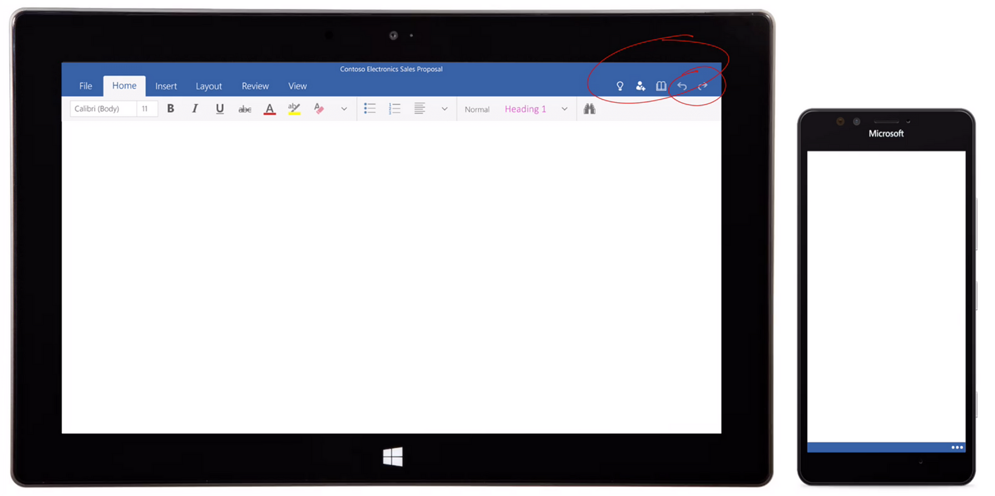
First we did some research to determine how important they really are. Maybe we could prove that on Windows Phone they weren’t as important? Or maybe we could tuck the functionality away into the palettes? These were all options, but first we’d have to figure out how to handle undo and redo.
Undo and redo have a rocky history on mobile platforms. On Mac and Windows, you could rely on undo being available at all times, but not so on smartphones. But you can’t just remove undo and redo from Word, Excel, and Powerpoint. The apps are far too complex for that. So undo and redo had to live somewhere. But what else? What did the apps need these hero actions for, anyway? Did they really need to take up all this space?
It turns out the answer is yes. There are a lot of examples, for many reasons, but the most obvious is Word’s toggle for going between print view and a reading mode. It looks like this:
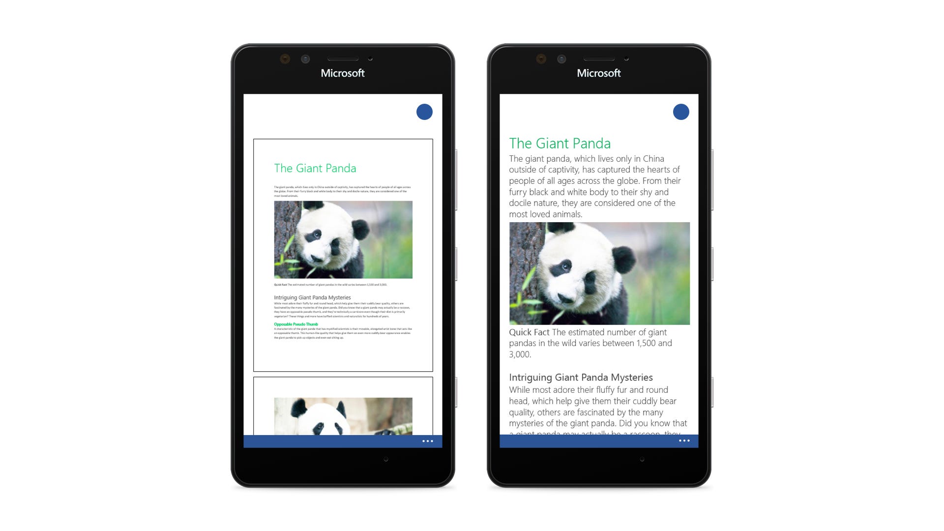
It’s a lot like reading a standard desktop-designed webpage, but then clicking into a Kindle-esque mode when you want something designed better for a small screen. Sometimes you want view, sometimes you want the other, and you always want a quick way to toggle between the two. So, the argument went, why not add hero buttons to the Windows Phone design? But we really, really didn’t want to add a bar on the top. So we tried tucking it into the top of the deployed palette like this:
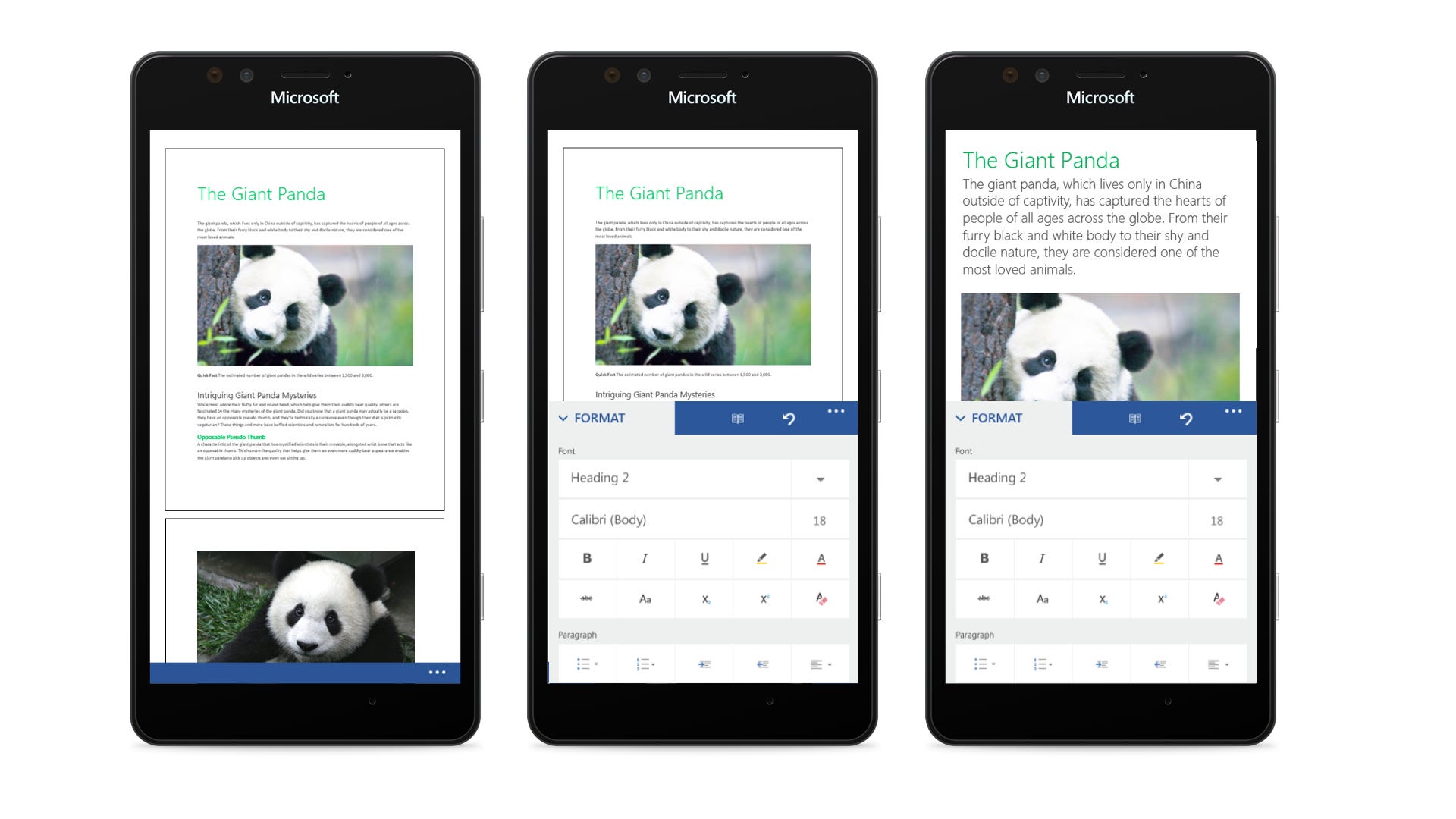
And that felt … ok. We didn’t like how undiscoverable it was, but we liked how it got us out of putting a bar across the top. We had been debating the bar across the top for months and months. Lots of meetings, lots of user research, lots of coordination with Windows Phone, but through it all this design made the most overall sense to us. Even if the hero actions were a bit buried. And that was definitely a concern.
But there was another issue that we were working through at the same time, one that ended up forcing our hand. The File Menu.
The File Menu
Here’s what the File Menu looks like on tablets.
It’s a pretty long list. And while it is possible to trim and combine them into a smaller list, this menu became the straw that broke the camel’s back. In our explorations, we had hoped we could tuck undo and redo into the palette. And also hero actions. And maybe it was ok that we weren’t planning on showing the document title across the top bar. And maybe we could get away with it feeling awkward on Android. But the evidence was mounting that we’d need a title bar, and the File Menu pushed the issue from “the design is getting a little clunky” to “this isn’t working.”
But that didn’t stop us from trying some last ditch things. Here’s us trying to put a hamburger into the palette, with predictably bad results. There are actually dozens of explorations around this, but here’s one that makes the idea look as dumb as possible.
We actually worked on this for months, because we were so thoroughly against the idea of losing so much real estate to a title bar. And we knew once we added one, our one hero action would turn into five, and that we’d end up with a damn hamburger menu. So we started spending a long time thinking about the hamburger menu and getting comfortable with it.
Guess What, Even Aliens Use Hamburgers
Wow, a lot has been written about the hamburger menu. But we can make it brief for the purposes of this essay. First, you shouldn’t use a hamburger menu if you don’t have to. Second, there are plenty of cases where you need to use it, and that’s perfectly fine. For example, and I’m just picking a scenario completely at random here, maybe when you’re dealing with a responsive design that needs to elegantly scale from four inches to 55 inches and has decades of expectations and features baked into it. Ya know.
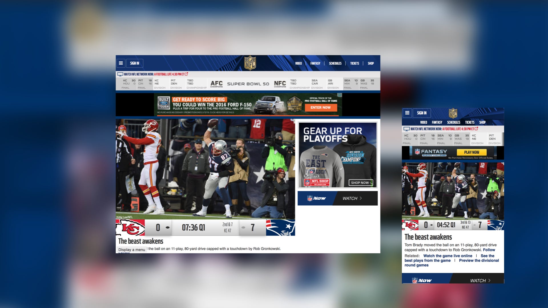
We see this all the time in software design. For example, here’s the NFL on a big monitor, with lots of things that would only fit on a large screen:
And here it is on a smaller monitor and on a phone. Notice that some things get tucked away on a smaller screen, then stacked on the phone. There’s just not enough horizontal space to fit everything otherwise.
This is not a design trend. This is not a fad. This is not art, fashion, or opinion. This is design physics. When you run out of space, you have to tuck things away or remove them. You see the same thing everywhere in our physical world, like trying to fit too large luggage into too small a space.

For example, if I come into your kitchen, some things will be one interaction away, like turning on your sink, opening your fridge, or turning on a light. Other things are two steps away but grouped, like finding your silverware or where you keep your coffee mugs. And a level or two away from that, you might find a junk drawer. It’s a little further out of the way, it’s got some odds and ends, but it does its job exactly right.
What if I were to dump your junk drawer out onto your kitchen table, yelling “Obvious always wins!” What if I told you it was a better design to have all those options available at all time to increase engagement with your take-out Chinese food menus, novelty candles that don’t blow out, and a warped 9 volt battery? You’d say you were happy with your junk drawer, because it keeps those things safely out of your view until you need them.
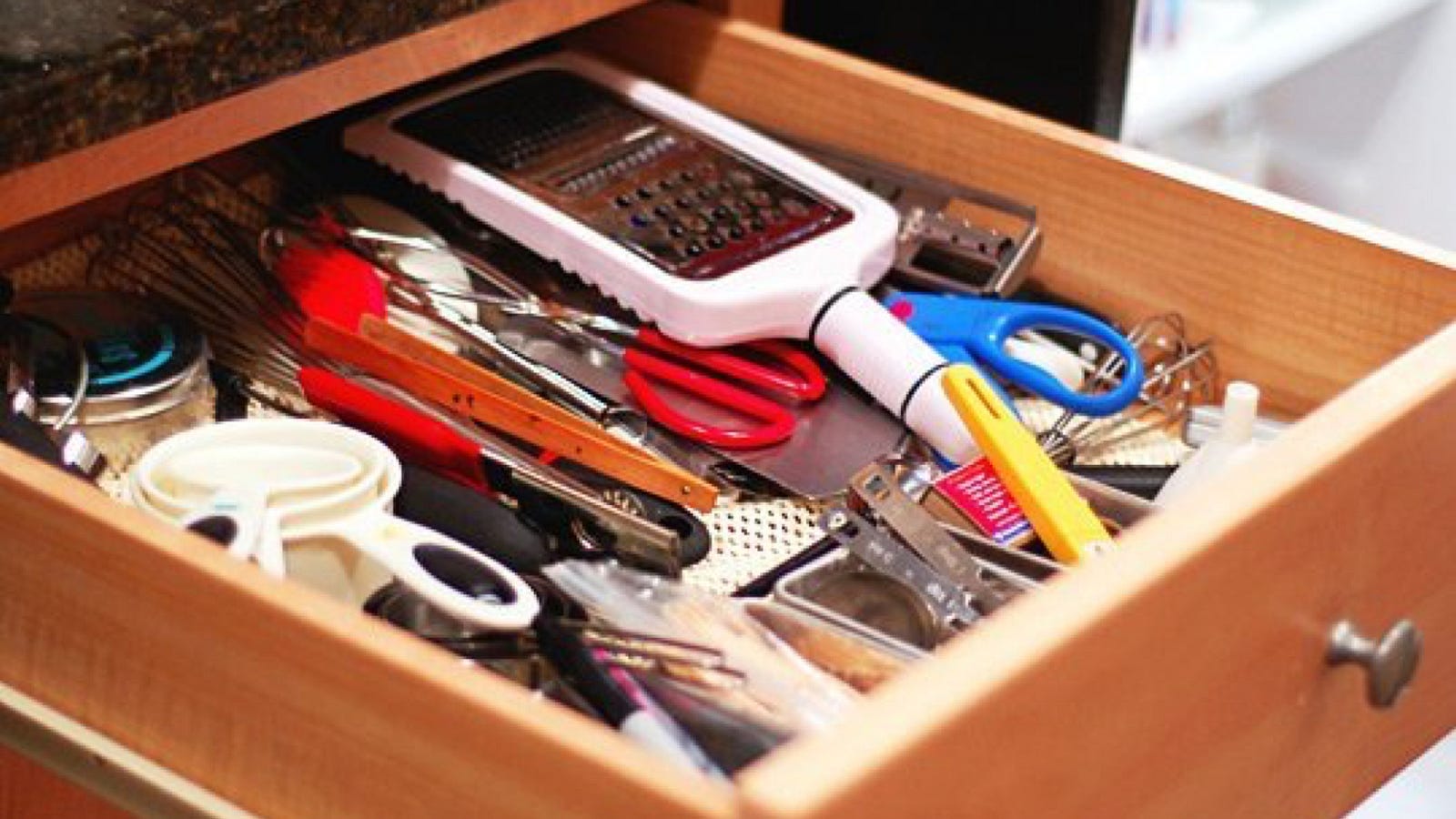
What if I told you you should throw it all away? What if I said if it’s not important enough to put on your kitchen table, it shouldn’t exist at all? That would seem crazy, right? Just because you tuck something away in a junk drawer, or four taps away, doesn’t mean you don’t care about it. It just means it’s not primary.
None of these points are breaking new ground of course. This is called hierarchy. Junk drawers are awesome because they provide a place for lower importance things to get out of the way until you need them. Hamburger menus, when used correctly, do exactly the same thing.
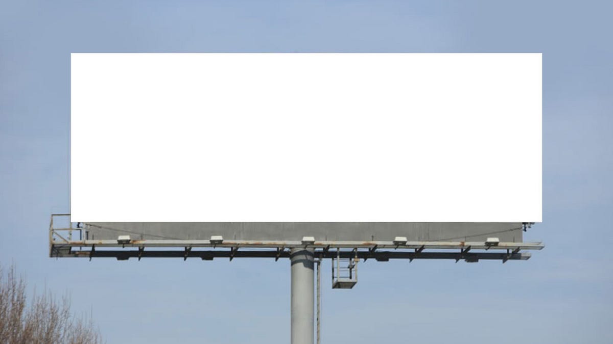
Now imagine an alien race, somewhere far across the galaxy. Let’s assume they have eyes of some kind. (Bear with me, this will make sense soon.) And let’s assume this alien species needs to communicate to each other. If those two things are true, eyes and communication, they come across this same law of design physics. They too print letters larger when things will be seen from further away (e.g. alien billboards). They too print letters smaller when they have to fit in clothing (e.g. alien business cards).

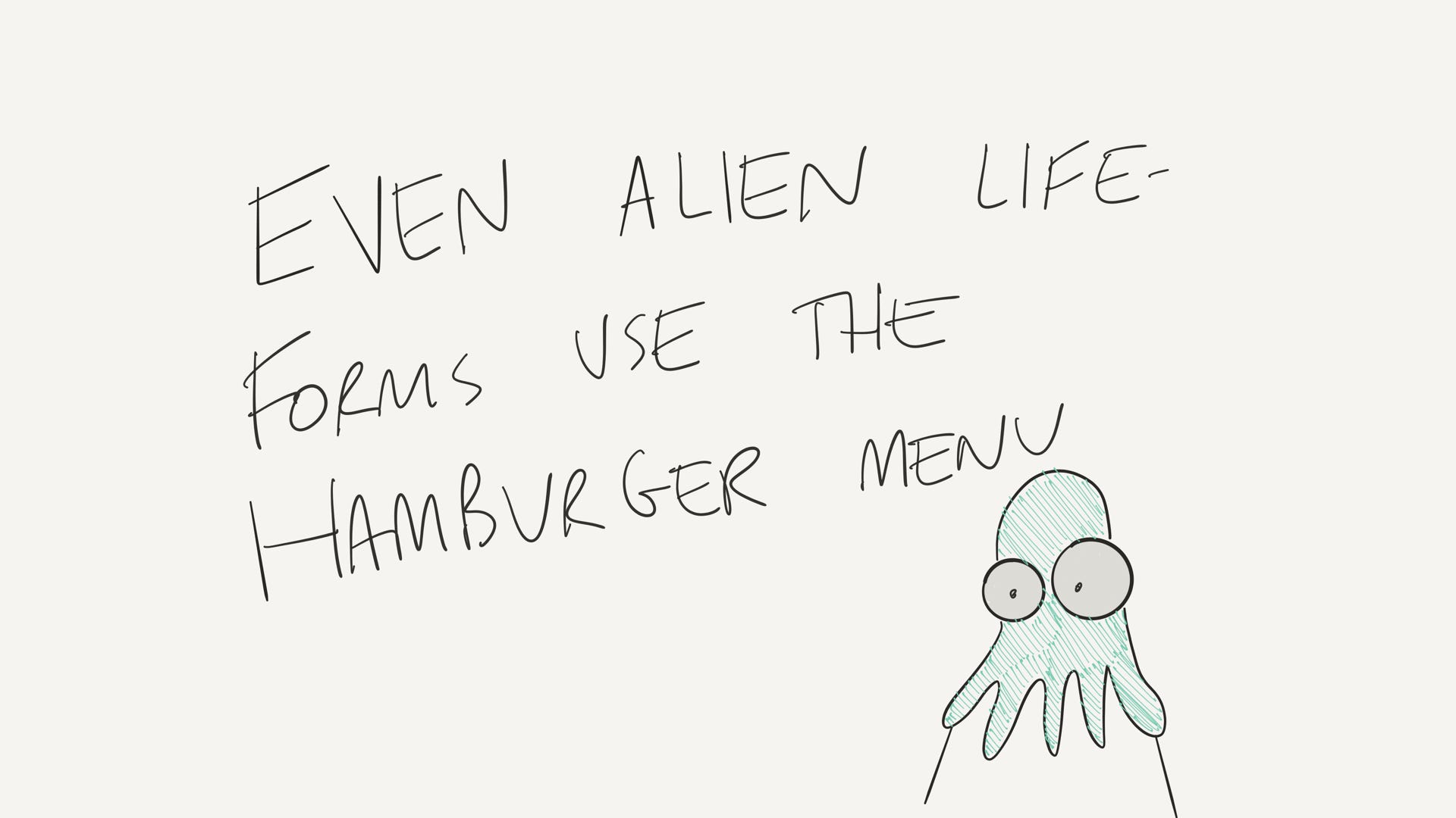
And they too, if they have software, use the hamburger menu or something like it. Maybe it’s not drawn with three horizontal lines, but I guarantee a design pattern that says “touch this button to see more options” is in use across the galaxy. And I don’t even know if aliens exist. But if they do, and they have something resembling software, they have realized that responsive design is the only way to translate a design from a small canvas to a large one. I believe this is as significant a discovery as fire or shopping malls.
Wait, what?
Let me explain. Life forms reach the point where they can use fire, or create machinery, or travel to other planets. And I think across the galaxy you’d see civilizations evolving their understanding of design from “making an artifact that will always be used the same way” to “I am building a self-aware tool that understands its context to present the most relevant version of itself.” I believe this shift is as fundamental and revolutionary as the first time humans learned to domesticate animals or NASA landed on the moon. It will become hard to imagine what life used to be like before it happened, because the shift is so radical and so obvious in hindsight.
So yeah. We used a hamburger. There’s no way around it when you’re dealing with software of sufficient complexity. It’s just design physics.
On Object UI
Somewhere along the way, I was asked to provide feedback on a deck that talked about “OOUI” or “On Object UI.” This is what Microsoft Office calls contextual UI, commonly shown via right-click menus. I looked through the deck and was impressed. It was long and well researched by a PM who had clearly done his homework.
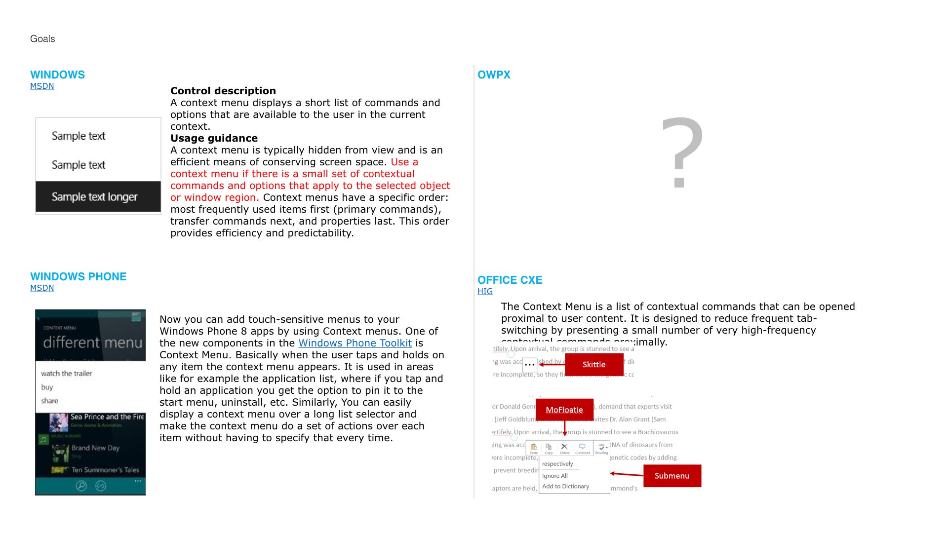
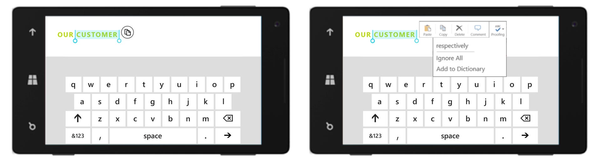
This slide was a pretty good summary of what I’d need to think through. See that question mark? That’s my team and the design I was leading up. He wasn’t sure how to make his design work on the phone’s tiny screen, especially since his proposed touch screen design wouldn’t fit:
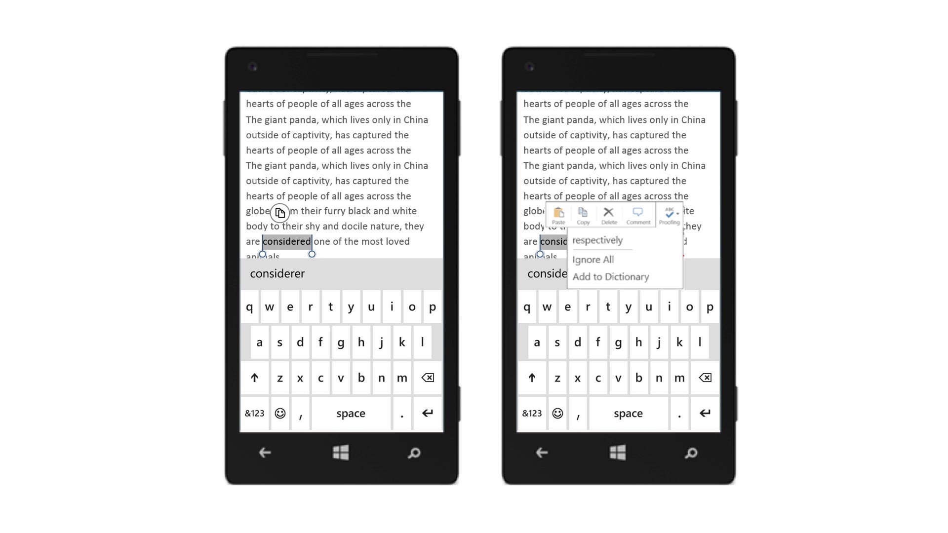
Notice the vertical space that it takes up, and compare to what Windows Phone’s copy experience looked like up to that point. It was clear the new design wasn’t going to fit very well in a portrait orientation, let alone a horizontal one. Look at how poorly this fits.
So we knew we had some work to do in order to align everything. A team of us got to work trying to come up with an approach that could work. One of the tools I relied on for communication is what I call my “two-minute videos,” in which I narrate over the top of some Sharpie text on a series of slides. Here’s a sampling outlining our two main concerns:
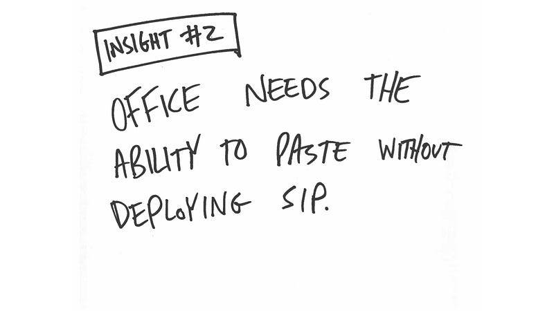
We had two options at this point:
- Ship something completely broken
- Fix it
And in option #2, we had two more options to choose from:
- The Office team writes the code
- Office asks the Windows team to write the code
But there’s the rub. These two options are worlds apart. This is the entire issue, boiled down to a single judgement call. This design decision was going to have a bigger impact than any icon, any typography choice, any copy, any on-boarding flow, any marketing campaign, or any reviews in the App Store. This is the whole ball game, folks.
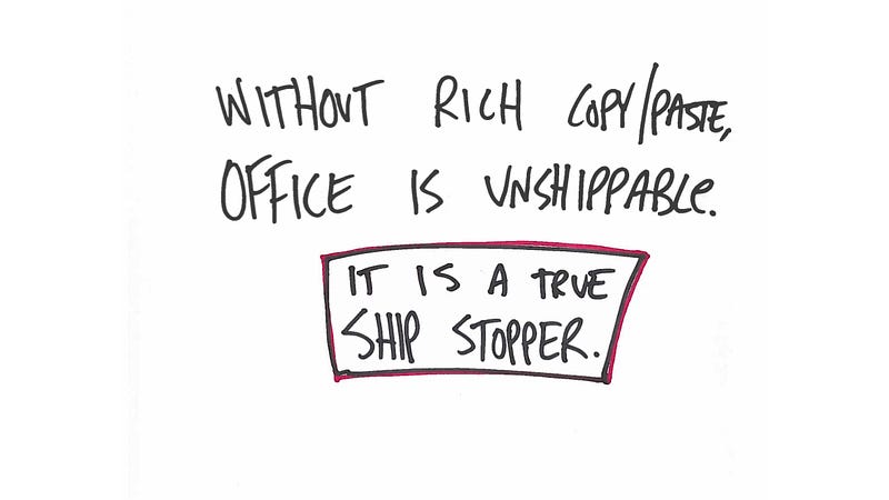
I tried to explain the significance of this decision in this slide:
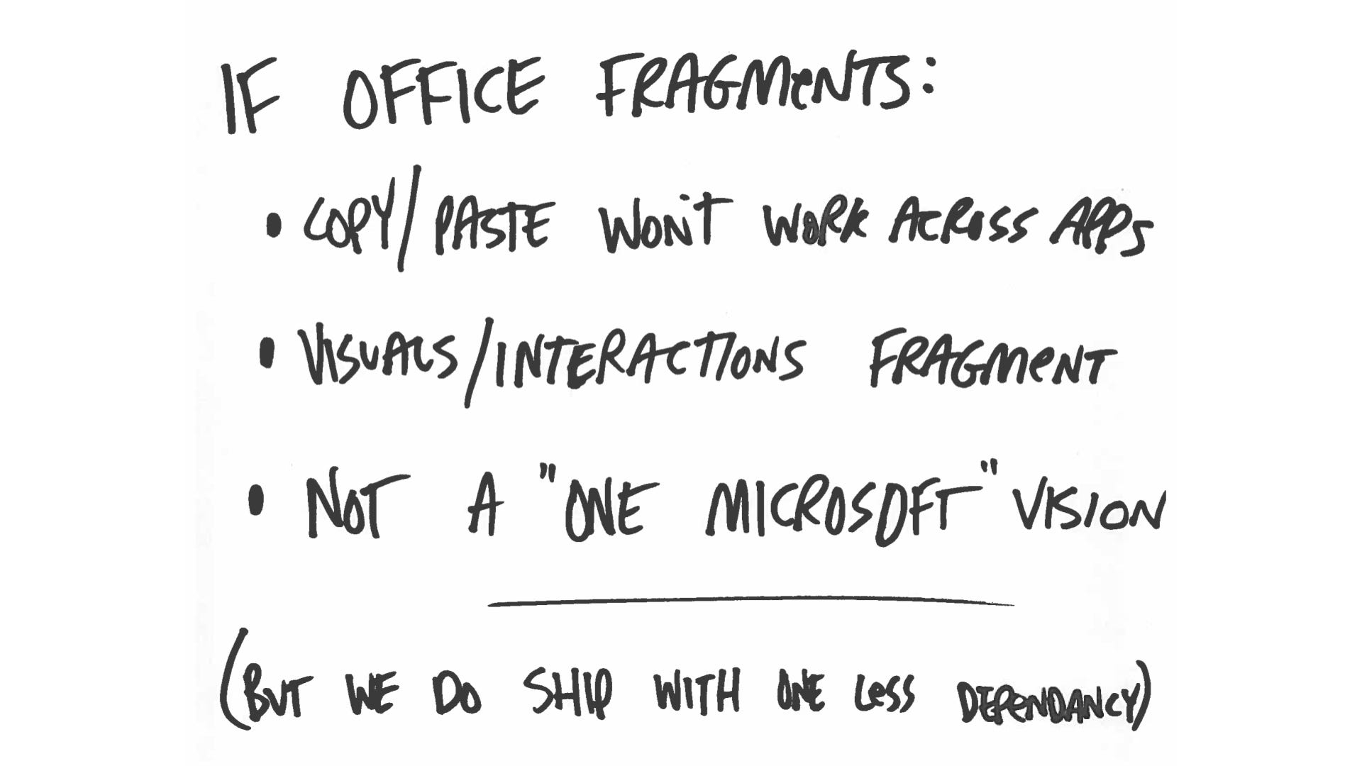
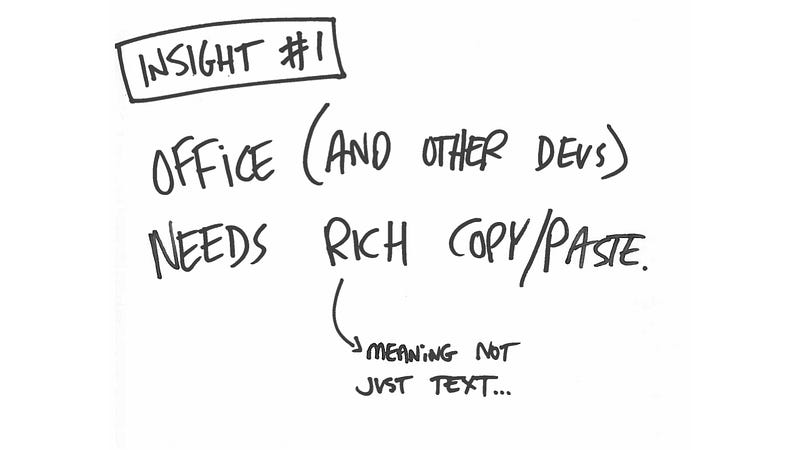
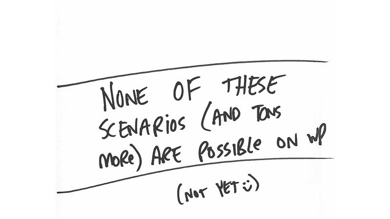
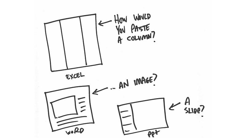
“Copy/Paste Won’t Work Across Apps” is as bad as it sounds. You’d copy someone’s phone number from a field in Excel, and go to paste it into Outlook, and it wouldn’t work. Worse, it would work, by pasting whatever was the last thing you copied on your device, just not Excel. This would mean four different clipboard histories — Excel would get one, Word would get another, and Powerpoint would get a third. Oh, and then the phone would have its own. Jaw-droppingly bad, right?
Next we have “Visuals/Interactions fragment,” which meant that Windows Phone would embrace a platform model that lights up copy/paste in completely different ways. The visuals would be different, but the interaction models would be too. Hell naw.
“Not a ‘One Microsoft’ vision” doesn’t sound quite as bad compared to the first two, but I wanted to throw it in there. Microsoft knows it struggles with cross-organizational coordination and collaboration, at least on an intellectual level. But when issues like this come up, it’s so hard to snap your fingers and “do the right thing,” as badly as everyone wants to.
Which leads me to a bit of feedback I got from my product manager that changed how I think about software. It’s partly brilliant, and partly bratty. It’s partly insightful and partly enraging. And it sums up so much.
A Quote I’ll Never Forget
I’m paraphrasing, but he said something like “This is great design work. I agree with it completely. But I’m not currently incentivized to follow the direction you’ve outlined.”
Your first impulse may be to grit your teeth. First, it’s super business-speaky. Second, it seems hostile to design. “Blah blah blah I’m not going to do good design because I don’t want to” is how it comes off, right? But read it again. Look at each section carefully. There’s a lot to learn from here. He said:
- This is great design work.
- I agree with it completely.
- I’m not currently incentivized …
- … to agree with you. At least not publicly.
He’s not saying he doesn’t want to. He’s not disagreeing. He’s not blowing me off. We all talk about wanting people to be honest, and here it is. He’s not allowed to agree with me. The incentive structure he’s under, as a young product manager, just won’t allow it.
Think back to the horizontal versus vertical discussion earlier. Product managers need to think very deeply (vertically) about their feature. Designers typically speak with several different PMs, and have to think more horizontally as a result. Horizontally, I had a point. Vertically, though? It’s a harder argument to make. And a harder one to win.
Put yourself in his shoes. You’re 24. This is your first big job out of school. You’re trying to do good work and impress your boss. You’re assigned the “On Object UI” framework, across multiple form factors. It’s a fantastically complex and impactful issue, one with lots of moving parts. You analyze the situation, figure out what the team can do and what it can’t, and then your designer says “we can’t ship this.” So you look into it. How long will it take to get it right? Probably about two years .
And not a low-risk two years, either. We’re talking about handing your feature, your baby, the single task you’ve been assigned to, to another organization. One that has historically caused your organization heartache by cutting features at the last minute. Office taking a big dependency on Windows sometimes feels like handing your baby to a taxi driver. It might work out. But it seems dangerous. So you’d rather not.
So here are the two options the product manager saw in that moment:
- Forfeit the feature, hand it to another team, wait two years to ship.
- Get my own engineers, who I am teamed with, to make it work.
The first looks passive and weak, and brings a ton of risk, all while pushing the release by two years. Can you imagine pitching that to your boss? “Hey, so it’s not my fault, but I think we should delay Microsoft’s marquee software on Microsoft’s marquee hardware (both Surface and Windows Phone) for two years while we hope another organization does my job for me because the experience will be better.”
And even if the boss understood why, then that boss would have to explain it to their boss. And then to another boss. Until finally you get to Steve Ballmer, where you have to explain why Office for iPad is amazing and ready to ship but Office for Windows won’t ship for over two years. On top of it already being pretty late to market.
So that’s not a particularly compelling argument to make. But designers rarely need to. And that’s a real concern, because it means designers are being asked to live in an alternate universe where only “great design” matters, not all the other factors that go into shipping software. It gives us a giant blind spot. And that’s a problem.
The Privilege of Design Thinking
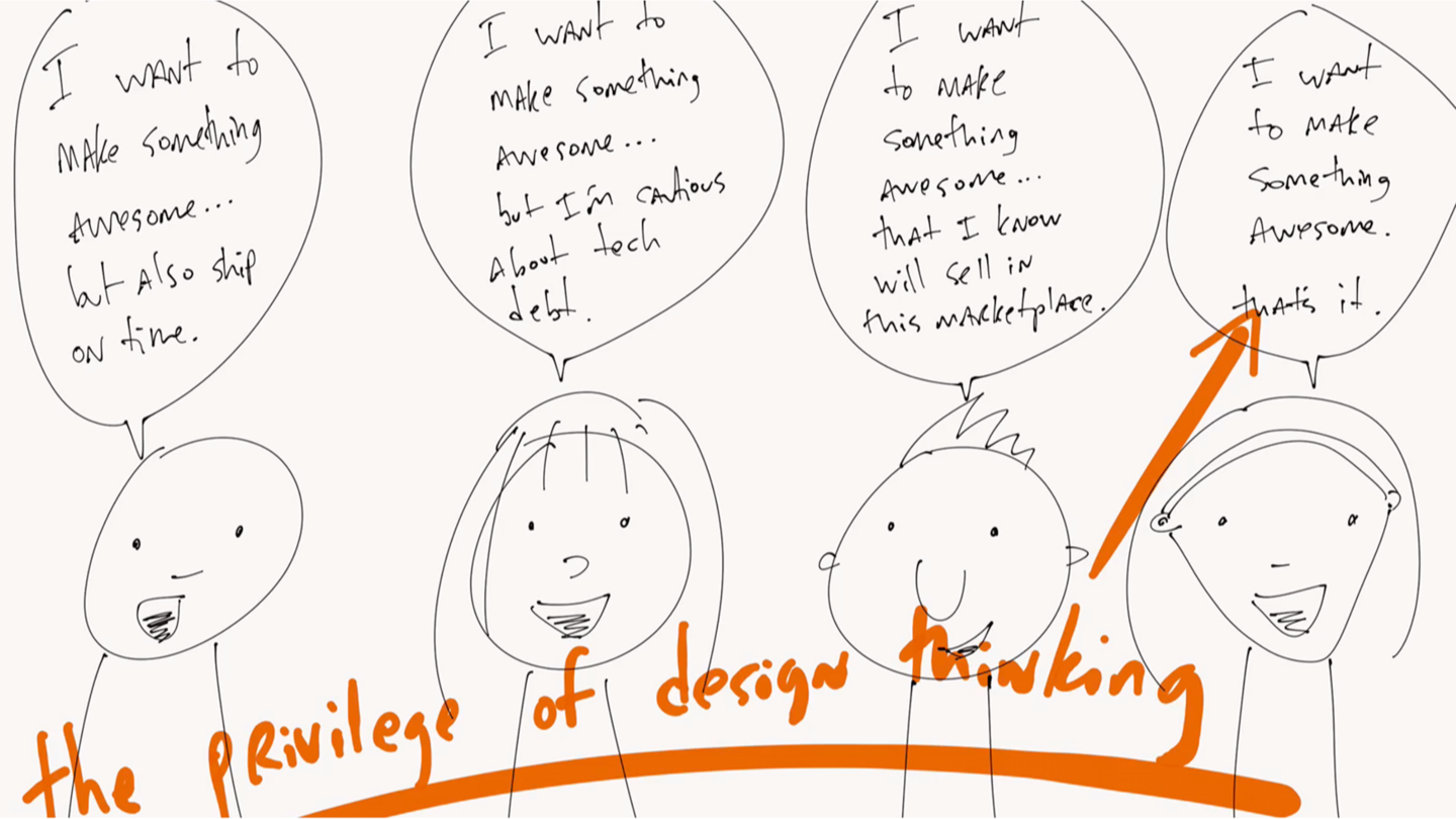
I used to work at frog design, a design consultancy. I remember being at a client’s headquarters, doing a pitch that went well, then pulling aside a stakeholder to admit something I probably shouldn’t have.
“Hey listen,” I said. “That stuff between slides 7 and 14? Those ideas aren’t technically possible, so-” but he cut me off. He said “I know. That’s fine. We’re not paying you to ship, we’re paying you to be our inspiration. Let the engineers and product managers figure out all the details, but for now we just need you to keep bringing big ideas. We’ll sort them out later.”
Wow. So even when we were pitching things untethered from reality, he didn’t care. “With design work, that’s par for the course,” he told me later. In his mind, designers are asked to bring fresh thinking without having to justify it the same way everyone else in the business does. What a privilege.
If you’re a working designer, you’re probably a little offended by this. Of course we have to justify ourselves! Of course we don’t always win! Technical realities water down our ideas constantly! It’s hard out there! Are you saying it’s easy to be a designer, because it definitely is not!
And I agree. But it’s no harder to be a designer than a PM or engineer. I’ve done all three. Designers may have hard jobs, but only we get to play the “I think it’s awesome and frankly that’s all the reason I need” card. More importantly, we are often encouraged not to worry about technical realities. That’s a huge privilege. And it’s something to be aware of. It’ll make us much easier to work with and be around.
Let’s think back to the 3 core Design Explosion principles. Assume the team is full of smart people, that there are things you can’t know, and that you can’t judge and learn at the same time. Turn those towards your own teammates, especially ones you don’t get along with, and you might see the same principles apply.
Postscript
We ended up delaying the release. By the time the product launched, I was no longer working at Microsoft. But I was curious: what did they do? Did they manage to get the clipboard working across apps? Was it aligned between iOS, Android, and Windows Phone? What did they do with the hero actions? Did they stick with a hamburger? Did it feel right?
Here are some images of the shipping Windows Phone design. The first thing you see on the top left is … a hamburger! Tapping it does what you’d expect, with a slide in from the left, Android-style. I suspect the common control for deploying the palettes from the bottom is the same as they’re using for deploying the File menu from the left. I wonder if they made it a common control for all devs? We talked about that a lot.
They ended up with four hero actions across the top — Search, Reading Mode, Invite Contact (for collaborating on documents), and Undo. The Invite/Share one was a big sticking point for us. Google Docs is an important competitive threat, so Office wanted everyone to know that real-time document collaboration is a marquee feature now.
Then, on screen two, there’s the On Object UI! It doesn’t look like Windows Phone, but it does look like Office and Windows. And much to my delight, it appears they figured out how to make it copy and paste across all apps, not just Office ones. That’s a big deal. It also might partially explain why it took so long to get out the door. Code is hard.
(I wonder why the OOUI is running off the side of the screen? I’d guess it’s probably a bug on smaller devices they have queued up and ready to fix.)
In the third screen, we can see the palette design. They put undo and redo in there too, since all the hierarchy traversing sometimes requires it. Also I see the little lightbulb, which is a way to search for a command anywhere in the app. I’d like to see this everywhere in Windows (the way Mac OS X does) but in the meantime I suspect it’s Office only. We’ll see.
So what did the iOS team do? Let’s take a look:
Lots more going on at the top, and some key differences that make it more iOS-friendly. First, no hamburger. Instead, they split the functionality into two buttons. The back arrow takes you to the document list, and the next button takes you to their File menu.
Then they’ve placed an undo button, followed by an edit button, then the three items on Windows Phone: Reading Mode, Search, and Invite. And that edit button is what deploys the palette. The palette itself has a different visual treatment, but works largely the same way as Windows Phone.
Here’s what the Android team did:
There’s the hamburger, surprising no one. Then the edit button to deploy the palette, same as iOS. Then Search, Reading Mode, Save, Invite, and Undo. Wait, save? Why? I have a theory about this.
In the tech world we often overlook the constrained bandwidth of emerging markets. When you study and design for these markets (something I do at Twitter now) you hear terms like “data sipping” and “offline mode” that all point back to the same central point: bandwidth is costly. When you’re on free wifi, users can afford auto-saving every minute. But on mobile, especially in emerging markets, that kind of aggressive saving can impact battery life and data plan usage. People often want more control over what data their phone is requesting over the wire. Thus, a save button.
And that wraps up issue #4 of Design Explosions! Thanks for reading, and I’ll see you when issue #5 comes out. It’s going to be a fun one.